
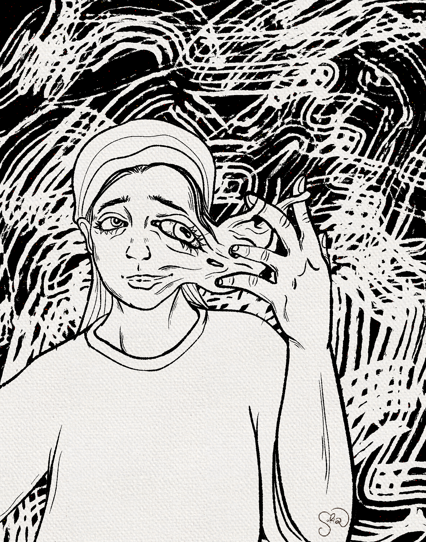
Sofia
Meyer
Graphic Designer | Branding & Digital Media
Hi, I’m Sofia -
A graphic designer and creative storyteller passionate about blending art and design to connect people. With a degree in Film Studies and Art from UNC Wilmington, I’ve worked on everything from gallery branding and promotional posters to social media campaigns and digital illustration.
I love the process of taking an idea from sketch to final design and seeing how visual storytelling can bring communities together. Whether I’m designing a logo, crafting a social campaign, or experimenting with digital art, I’m always looking for ways to make design meaningful, accessible, and impactful.


Case Study 1:
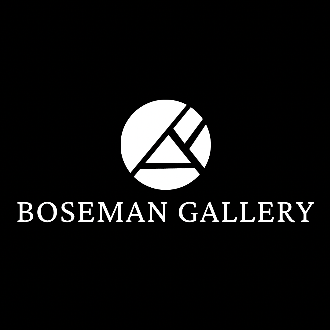
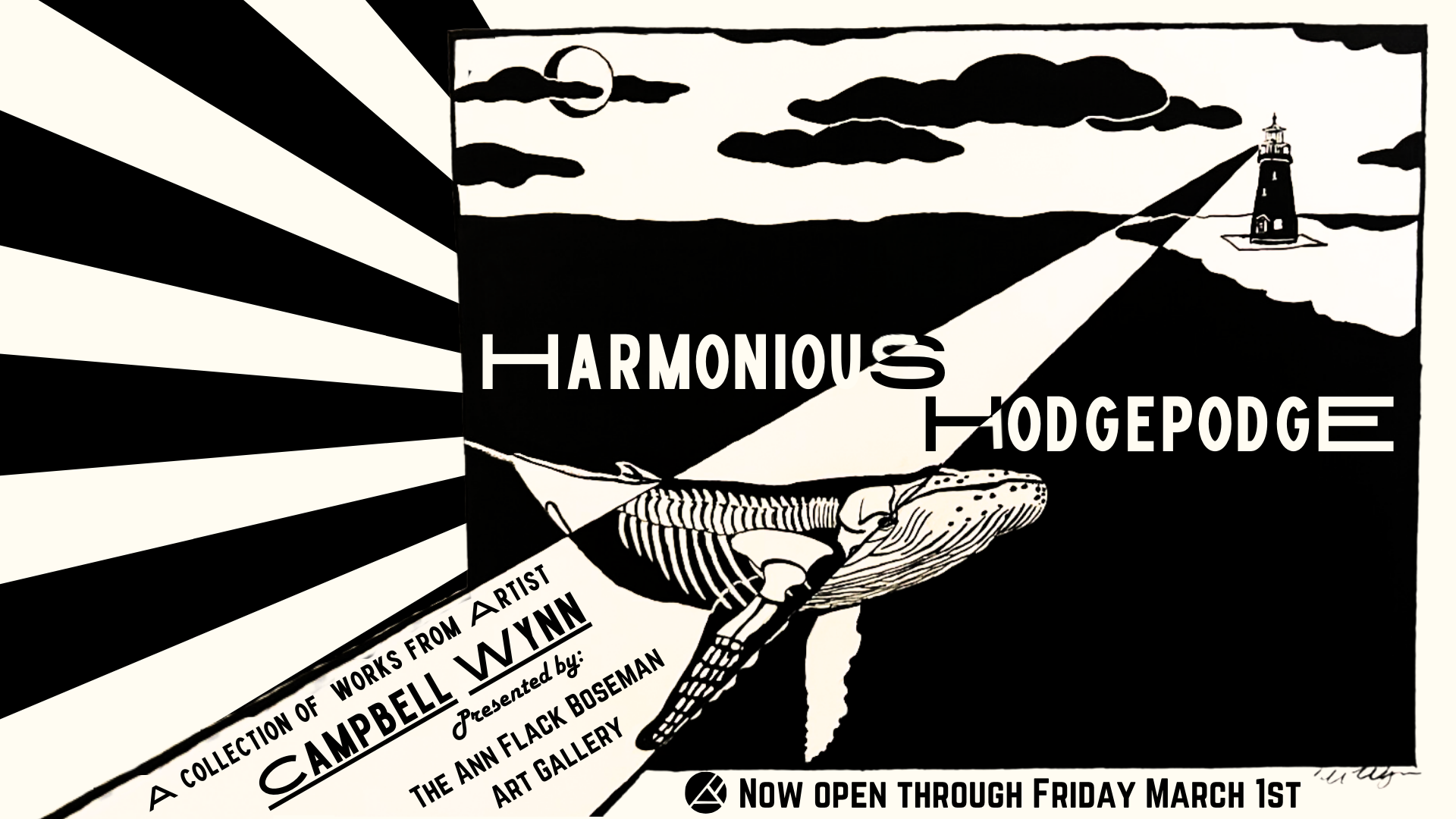
Boseman Gallery Logo Redesign
-
The Ann Flack Boseman Art Gallery at the University of North Carolina Wilmington (UNCW) needed a refreshed logo that reflected its role as a vibrant hub for student and faculty exhibitions. The gallery wanted a visual identity that was modern, versatile, and professional — something that would look equally strong in digital media, event posters, and printed programs. Updating the gallery’s logo was an important step in elevating its presence on campus and making it recognizable to a wider audience.
-
As the lead designer on this project, I was responsible for taking the gallery’s need for a refreshed identity and turning it into a polished, usable design system. Specifically, I:
Researched fonts, styles, and design trends that would work in both print and digital contexts.
Sketched and developed conceptual ideas using Procreate.
Created polished digital mockups in Adobe Illustrator.
Collaborated with my supervisor to review options and refine designs based on feedback.
Delivered a final logo package that could be scaled and applied across multiple platforms.
-
1. Research & Sketching
I began by exploring visual inspiration from other university galleries and cultural institutions. My focus was on clarity, legibility, and adaptability. Using Procreate, I experimented with different letterforms, line weights, and arrangements, generating a range of initial concepts.2. Digital Mockups in Illustrator
From those sketches, I translated the strongest ideas into vector form in Adobe Illustrator. This step allowed me to experiment with proportions, negative space, and scalability — critical elements for a logo that would live on everything from social media icons to exhibition banners.3. Iteration & Collaboration
I presented three variations of the logo to my supervisor, each with subtle differences in typography and composition. Through feedback sessions, we narrowed down the strongest design. Over three rounds of iteration, I refined the typography, spacing, and balance until we reached a mark that felt both contemporary and enduring.4. Final Selection
The chosen design struck a balance between professional polish and student-friendly accessibility. Its clean lines and adaptable format made it suitable for both digital and print use, ensuring consistency across all gallery communications. -
Outcome & Impact
The final logo was adopted as the official identity of the Ann Flack Boseman Art Gallery at UNCW and remains in use today.
The new design created a stronger, more cohesive presence for the gallery on campus, reinforcing its role as a professional exhibition space.
Feedback from faculty, staff, and students highlighted the logo’s clarity and adaptability.
Personally, this project deepened my experience in branding, iteration, and collaborative design — skills I carry into all future creative work.
Case Study 2:
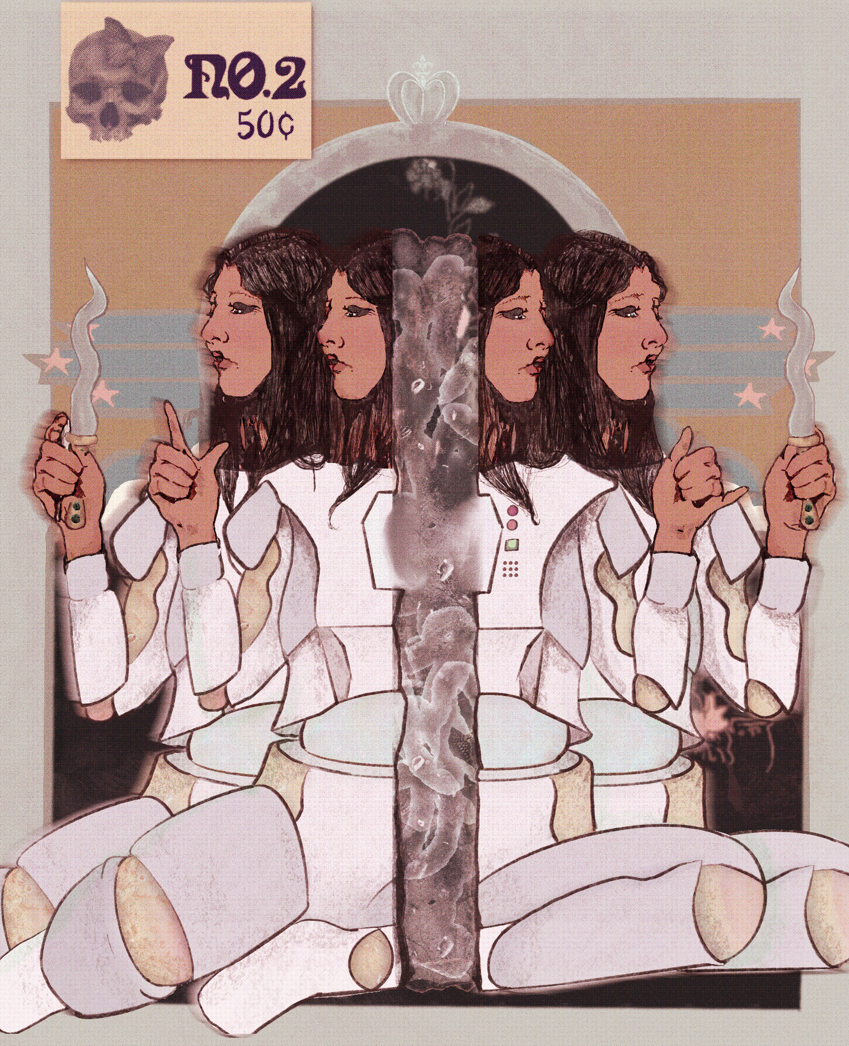
Promotional Poster for Book
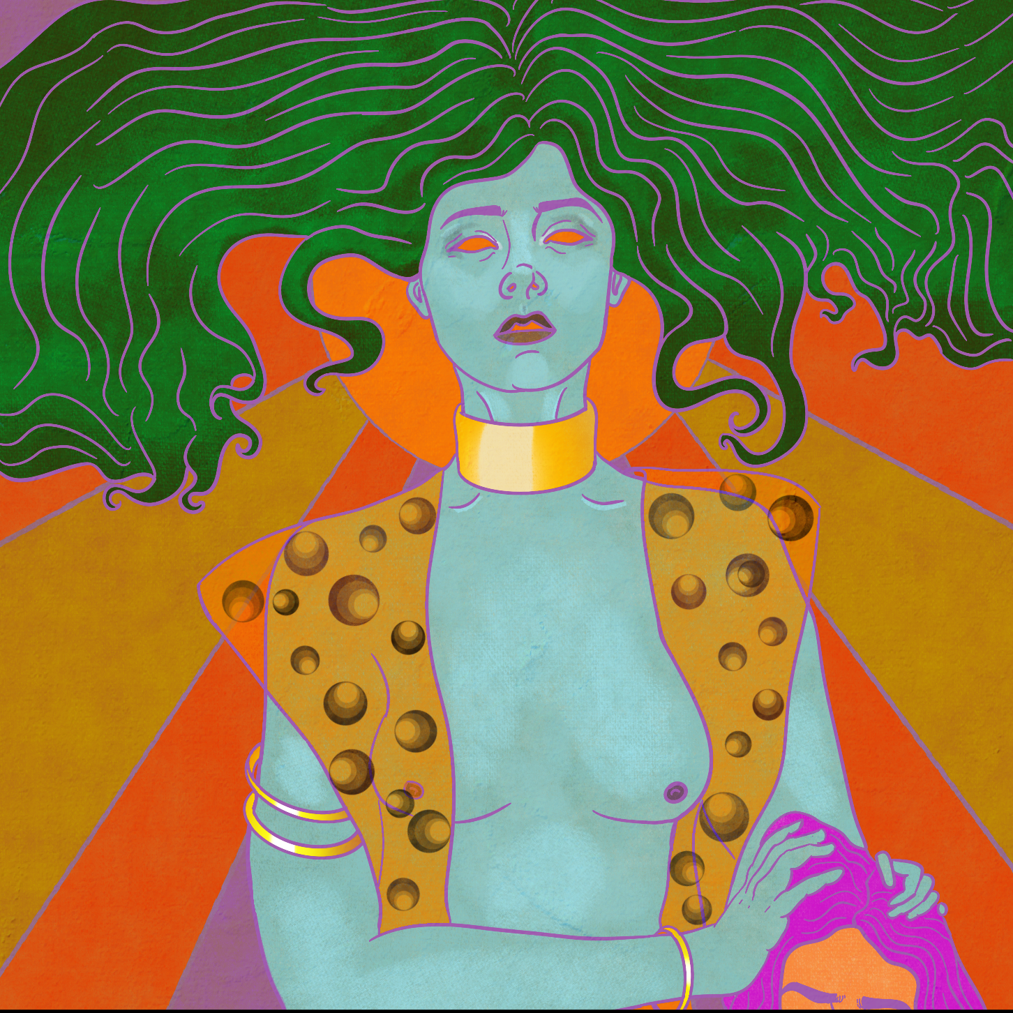
-
A client approached me with the vision of creating a hand-drawn cover for their science fiction novel. They wanted a design that felt emotionally charged and visually striking — one that would immediately immerse readers in the world of the story while highlighting two centr
-
As the illustrator and designer, I was responsible for:
Interpreting the client’s references and narrative to create an authentic visual translation of their story.
Illustrating two key characters, ensuring accuracy to the descriptions while maintaining an engaging aesthetic.
Developing the background, textures, and visual effects to enhance atmosphere.
Integrating hand-drawn elements with digital assembly for a polished final design.
Delivering a high-resolution cover ready for both print and digital publishing.
-
1. Character Illustration
I began with rough sketches in Procreate, focusing on the female figure — a central character. Using layers, I refined line work, then applied color and rendering to create depth, emotion, and presence.2. World-Building Through Background
Once the main character was established, I shifted focus to the background. Drawing and rendering directly in Procreate, I developed an environment that reflected the novel’s sci-fi tone while also supporting the emotional weight of the figure. Details like the “50 cents” tag added narrative intrigue, grounding the design in a retro, pulp-inspired style.3. Integration & Effects
I imported the illustrations into Photoshop, where I assembled the composition. To give the design a cohesive, cinematic atmosphere, I experimented with brushes and applied filters to create a glowing effect in the center of the piece. Finally, I layered a subtle grain texture across the cover, enhancing its tactile, graphic novel feel.4. Iteration & Client Collaboration
Throughout the process, I remained in dialogue with the client, checking that the characters aligned with their vision. Adjustments were made to capture personality and mood, ensuring the final cover felt true to the story. -
Delivered a dynamic, hand-drawn book cover that successfully balanced character focus with immersive world-building.
The client was thrilled with the final design, noting that it captured the emotional intensity they envisioned.
The cover is being considered for use in the graphic novel version of the book, giving the artwork potential for wider distribution and impact.
Personally, this project strengthened my ability to merge traditional illustration skills with digital de

Case Study 3:
Activity Book Cover for Clean Energy NC
-
As part of the North Carolina Business Committee for Education (NCBCE) internship, I was given the opportunity to contribute to a high-impact state project. A Kenan Fellow teacher partnered with Clean Energy NC to create an activity book for children in grades K–5, designed to educate and inspire the next generation about renewable energy. This project carried statewide importance, as it aimed to support classroom learning while promoting awareness of clean energy initiatives.
My specific responsibility was to design the cover for the activity book as well as develop engaging activities and coloring pages. The cover needed to be bright, approachable, and educational — something that would immediately capture the attention of young learners and teachers alike, while reflecting the mission of Clean Energy NC.
-
As the designer on this project, I was responsible for:
Conceptualizing and illustrating the cover artwork.
Creating kid-friendly activities and interactive coloring pages aligned with the clean energy theme.
Ensuring the visual design was engaging for children while maintaining professional polish for statewide use.
Collaborating with project stakeholders to ensure the design aligned with educational and branding goals.
-
1. Sketching the Concept
I began with a rough draft sketch, brainstorming cheerful, simple elements that would resonate with children: a smiling sun, rolling hills, soft clouds, and playful typography. The goal was to create a sense of positivity and curiosity about the subject of clean energy.2. Building the Elements
I individually illustrated each element — the cloud, sun, and hills — before bringing them together into one cohesive composition. This modular approach allowed flexibility in arranging and balancing the design.3. Digital Composition in Canva
After coloring the elements, I imported them into Canva to experiment with layout and typography. I tested multiple font options before deciding on one that felt both playful and clear for young readers. I arranged the illustrated elements around the title, ensuring balance and legibility, and then applied a subtle green tint across the design to tie everything together and reinforce the environmental theme.4. Iteration & Collaboration
I collaborated with both NCBCE mentors and Clean Energy NC partners, sharing progress updates and receiving feedback. Together, we refined the cover to ensure it aligned with the educational goals of the project and felt accessible to K–5 students. -
The final design was enthusiastically approved by stakeholders and is now the official cover of the Clean Energy NC activity book, which is currently in production.
The client praised the design’s ability to be both educational and engaging, capturing the clean energy theme in a way that resonates with children.
The activity book will serve as an educational resource across the state of North Carolina, amplifying its importance and reach.
For me personally, this project demonstrated my ability to handle a statewide initiative with real educational impact, and it strengthened my skills in designing for diverse audiences, from children to institutional stakeholders.
Contact
405 Powers Ferry Road Cary, NC 27519
Phone
(804) 536-1707
Email
symeyer14@gmail.com
References provided upon request